Wednesday, 11 December 2013

Genre DPS analysis

1) The main feature on the double page spread is the artist on the left, Wiz Khalifa. We know this it has his initials on the right hand side of the page and the face of the artist himself.

2) The image of Wiz khalifa dominates the left hand side of the page, covering the whole of that page with no text.

3) As it is a close up shot of the artist, he is wearing a hat which is specifically a snapback. In the hip-hop genre this is the hat that artists will wear, bring back the old style hats in the 90's and is now a trend again. He also seems to be wearing a grey top, whether a sweater or t-shirt.

4) The size of the image is very ale, covering the whole page of the left side and not the right hand side of the page. It has no text on it.

5) It is a close up shot of the artists face, showing what he is doing and he facial expression he is giving. This creates enigma to the reader as his expression is serious.

6) The headline uses a pun, the word high can suggest two things. First it could be that it can relate to the artist lifestyle of the artists success or secondly how high the artist is. Smoking marijuana makes the person high and it is intended that Wiz Khalifa is high because he is seen smoking and represented in the media to smoking this drug. The reader will be interested on the content because it can relate to both the artists lifestyle or the drug he smokes.

7) The article does not use a pull quote although the artists initials is a bigger text than the other texts on the page, in the colours of black and yellow as recently Wiz Khalifa had released the song 'black and yellow'. This advertises the song and makes it stand out on the white page.

8) The writing seems to be separated into two sections, neatly. The colour of the font is black which helps the writing to be readable and standout on the white page. The information is not separated as it is put is less paragraphs and more of just chunks of writing. The writing is all stuck together and do not separate each in lines. A few of the writing is in another colour to represent that information is important

9) The by line is located at the bottom of the image, showing the stylist and photographer of the main image of Wiz Khalifa.

10) The baselines for the body text is equal.

11) No it does not as bot pages are separated to show the main image and text.

12) The width of the body text is equal, the body text is kept on just one page at the bottom on the right side of the page.

13) It rhetorically asks' the reader "How High?" but leads to more of a story that happened to the artist, it is typed in the writes informal language and colloquial. The text tries to describe the artist in a way the reader can imagine it themselves.


Thursday, 28 November 2013

Mood Board


Inspired from the east coast music movement, 'Beast Coast' which features various groups and artists who represent its urban hip-hop music. This can help to see what my artists for my magazine should be wearing, the way they pose and display expression etc.

Artist Case Study

Joey Bada$$
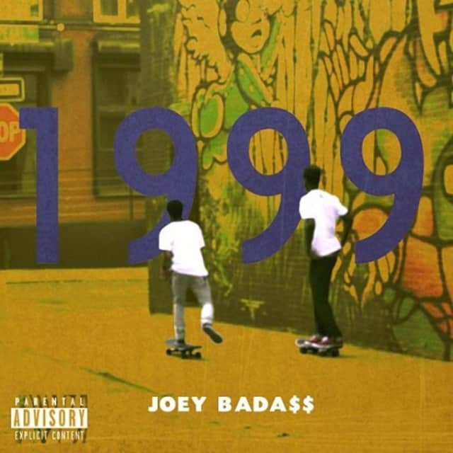
He was born on January 20, 1995. He is an independent hip-hop artist from the city of New York. He is one of the founders of his group "Pro Era", he debuted his first mix-tape back in 2012 which was called '1999'. He was highly recognized for and his fan base has grown since, now he is presently making his new album B4.Da.$$ which is due to release in 2014. Ever since uploading his music on YouTube it has helped to become one of the iconic rappers you don't normally see. He is more of a rookie in the hip-hop game as he is still young and is presently the age of 19/20. He has associated with other rappers in his area of New York, which is the Flatbush Zombies, The Underachievers etc. He has told record labels he would not sign to a major record label, as during the year of the coming end of 2012, his best friend and member of Pro Era Capital Steez had passed away. He has been featured on other track with big names in the Hip-Hop genre, such as Kendrick Lamar, A$AP Rocky etc.

Joey's first mix-tape - 1999
Joey's second mix-tape - Summer Knight$

Research - Hip-hop genre

Thursday, 14 November 2013

Audience Research - Questionnaire Results


My target audience was the age of 15-21, almost my range of audience I wanted was teenagers as the Hip-Hop genre apply to the young and not adults. Looking at the research I have done, most of the people voted that my magazine should have the color scheme of black, white and red. Red seems more of a masculine color and this was picked because there were mostly males undertaking the questionnaire. This helps to decide that I should use main colors which other hip-hop magazines use which also, other colors such as gold, white etc. To appeal more to my audience I must do what the public like, so the people have picked one of the cheaper prices for a magazine, £3.00-3.99. Customers are more likely to buy a cheaper and good quality music magazine that appeal to them. I am now certain that the name of my magazine 'Central' will be appropriate with the genre I am doing. 
For the gender of artist to be on my contents page, 4 people had voted for mostly males, 1 had voted female and 3 others voted for both genders. What this results show is that the majority of people who took in my questionnaire were mainly male, that my magazine should consist of male hip-hop artists because it is the gender found in the magazine. 

With my question 'do you prefer a magazine front cover with a lot of sell-lines or a few?' 75% had voted for a lot of sell lines. This means that my magazine will sell if my magazine were to contain sell-lines which consumer, 


Music Magazine - Planning Sheet


What genre of music will your magazine cover? 
I will cover the genre of Hip-hop, as its culture is well known to our age audience.

Who is the target audience? How old are they? Where do they live? What are their interests? 
It will be aimed at a young audience, the ages of 16+ including both genders and the ages of people in there early 20's. Mostly young men will interested in new artists and to follow the latest trend. It could be anybody of this age found in the city of London, people more interested in America's hip-hop.

What is the name of your magazine? Why? Connotations?
The name of my magazine will be called 'Central', as Hip-hop started in the south Bronx and started the urban movement into a culture for many. I will make it focus on east coast music genre, mainly as it isn't well known enough.

What will your masthead look like? Do you have any ideas for fonts?
The font will be bold which will be visible for the readers, the colour will be in a gold plated or even purple/green as it can relate to the hip-hop culture, gold chains and money or simply old hip-hop.

What will be the focal image for your front cover and why?
The main artist in the middle of the front cover so he/she will be the centre of attention.

What photography will be required? Give details of shot type, angle and composition?
It is a mid shot to show the main artists attire which will be taken at an normal angle framed around he or she. The photography will be from a high quality camera which can be a DSLR.

What mise en scene will be required? Location? Clothing? Make up? Lighting? Use of colour? 
There will be a plain background either black or white which is one of the colours that dominate most backgrounds in hip-hop magazines. The clothing will be like the latest trend that most hip-hop artists wear such as A$AP Rocky or Joey Bada$$. The lighting will be shining down and focused on him.

What would be your sell lines? How will you entice your target audience?
Sell lines will include other news and upcoming artists, including their life story, journey or interviews with them. With having other artists audience will want more content rather than just one main artist that won't appeal to everyone in my audience.

What items and feature articles would you need on your contents page?
Some features that will be needed will be exclusive content such as interviews or pictures of different artists or items related to hip-hop. A live performance and or a competition that readers will want to enter to get free tickets.

What is the focus of your double page spread?
It will be about the main artist, on his recent interviews and reviews on his or her music. I want my main artist to be the main focus of the magazine.

What photography will be required for the double page spread?
It will be on the main artist who will cover or stand out on the pages of my contents. It will also feature other artists in the background to show that my magazine contains a lot of content for the reader.

Friday, 4 October 2013

Angels magazine analysis

The front cover of the 'Angels' has less text with more of the main artist in the image is standing out. With the headline 'Respect' it can relate to the main image of the magazine, as she is formally dressed in respect of the school with the St. Angela's. The main focus is on respect as it says on the headline, which is what the young lady in image is trying to address. There is only one image on the magazine, which is the young lady, which shows that she maybe 16 as the sell lines include a 'sweet 16'. It is a mid-shot, she is posing in slightly slanted position pointing at its reader, showing she is ready to address the main focus of this magazine. The colors of the magazine don't match with the masthead as it is pink, everything else is orange and white. The colour scheme for the magazine does not go well. Although the white seems to stand out more rather than the bright orange/peach, can be clearly seen which stands out in front of the image.


The contents page does not include the logo of the magazine but does contain the word contents within it to show that the reader is reading the contents page. The text dominates most of the page with only about 2 images that show this is a school/student magazine. It has the issue date of the magazine, the subjects of the magazine are split into 4 categories but it does not have the page numbers needed for where the reader wants to find out which to read on what page. The features of the magazine relate more to what girls really like, music, books and some information about school. Although it is odd that the titles for each categories are not starting with a capital letterBy the top of the contents page the text box is in black so that it stands out on the white background, they want to get the readers attention as it starts of with 'Dear reader' which wants to inform the students about something important.


Tuesday, 1 October 2013

Contents page (Photoshoot)

For the contents page, I just wanted the basketball rim and ball itself in this image for the background. This shows that it fully relates to the magazine itself with the magazine aimed at basketball fans. The backboard will contain writing for the main subject of the magazine which is Chandlers success for basketball.

Sunday, 29 September 2013

Official Magazine cover (Photoshoot)

I decided to use Chandler as my main model of my sports magazine, having him dressed formally in his school attire in an urban outside court. I wanted to show the contrast between his 'successfulness' with basketball, a dream come true for many players and an outside, rusty court. This shows he started from the bottom and made his way to the top. Wearing his shirt and tie shows how much he is progressed in the basketball game. Having done a mid shot but looking up at him also shows his status within the game of basketball. The colours of the ball matched around with the background, having an orange/yellow ball with the orange rim, bricks which dominant this image. Wearing full black made him stand out on such a bright day.

Pencil sketch of magazine cover


Wednesday, 25 September 2013

Magazine idea

My idea of what my magazine might be is a sports magazine on young talented basket ballers, I put the name of the magazine 'DSN' which is don't shoot now. Its main content is basketball. The model for my front cover could be a person who play for a team, using someone dressed in a suit holding a basketball, with the headline being 'hoops and dreams' as this person may want to be successful in his career which is a dream that young talented youths have, who play basketball. A mid-shot to show his formal attire with a basketball, to clearly show its an interview for the player and contrast between formal and sport. The location will in a basketball court, showing the rim. 
For sell lines there will be other content like other stories to do with basketball and other content on different sports news. The audience who likes a variety of sports will be interested. A basketball to show the magazine is all about basketball, his suit attire to show he maybe be successful in his career. The contrast between an outside court to him wearing a formal dress wear. To represent how much this player has gone through and and success.

Monday, 16 September 2013

Magazine

The masthead for this music magazine is "VIBE", which vibe is the aspect of a music genre mainly for hip-hop. The masthead can be clearly seen on this magazine as the artist on the front 'Kendrick Lamar' is transparent. On top is a strap line which shows 2 hip-hop artists names at the top. By making two artists compete with each other, draws the reader want to know who has better music and is a 'genius'. Showing other general artists can help those are interested with these artists to give the reader other variety it may be interested in. Another sell line is 'Miguel - Sex, drugs and R&B', this is explicit content as most of the hip-hop genre artists have the use of explicit language. Also it is short and catches the eye of the reader, that his life is about the artist Miguel's life. The sex, drugs and his R&B career. All the fonts used seem simple and bold, nothing unique except that the large headlines and sell lines stand out. There is no change in fonts. Using the colours of black and red, which is a contrast between the main image which is white and gold. 

The main headline is 'The new God MC Kendrick Lamar', using a powerful term of calling a person GOD may show his status in the hip-hop game. This can relate to the the main image [mid-shot] of Kendrick as he is dressed in a white shirt with gold chains and a gold watch, also he seems transparent. He is not generally dressed like an hip-hop artist would look. The colour white portrays purity in religion such as what we Catholics think, the colour dominates the whole front cover of the magazine. He raised his hands as if the he is praying. Gold is like heaven as it is on the main things in life that are expensive and treasured. Him being transparent could show that he is ghost or an angel. The image represents that he is God-like, in terms of his music.

The sell lines are effective, the Miguel headline is short, not giving any distinct detail on anything else but its three main subject that revolve around Miguel. This will want the reader to find out more on Miguel's lifestyle, as sex and drugs happen in the life of people. On the right side the sell line steps away from its main content of the magazines hip-hop genre and introduces in issues of other leisure and entertainment like fashion, movies etc. Its effective as readers can find out more than just music in the magazine but with a different variety of other content it has. Its as big as the headline as this is the main content that the magazine wants the reader to read, showing an insight on the subjects it will cover. Most of the magazine has no sentences but just a word.
Hello fellow followers, welcome to my portfolio
My name is James, I'm 16 and will be 17 this November, a sixth form student who is doing AS media studies. I am very interested with media especially to do with mostly the music side of media, the way music videos portray imagery and hidden messages behind it.